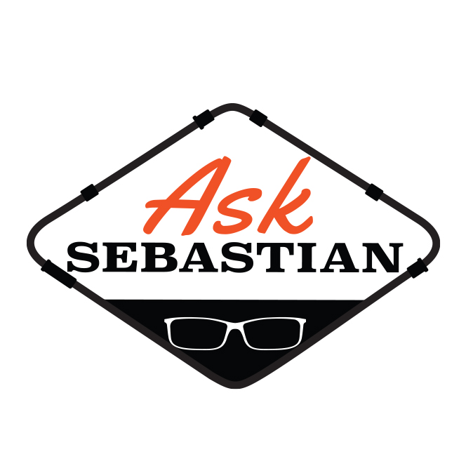
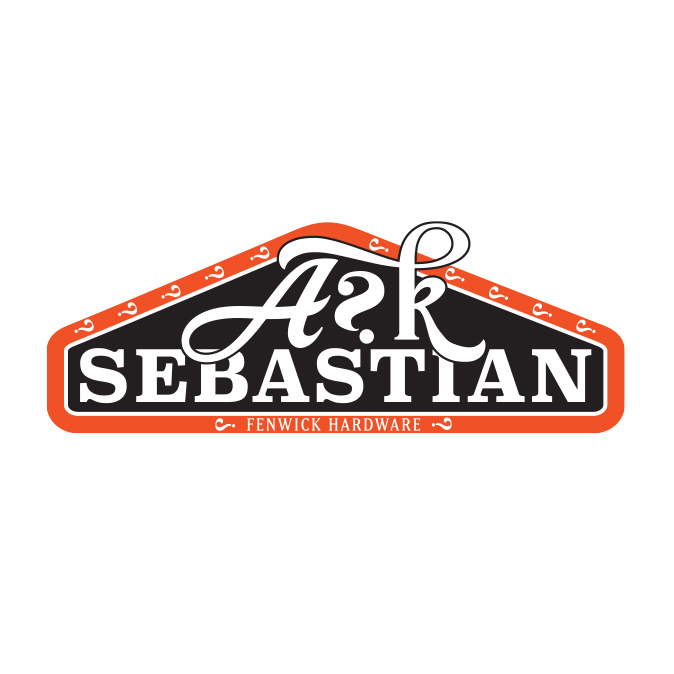
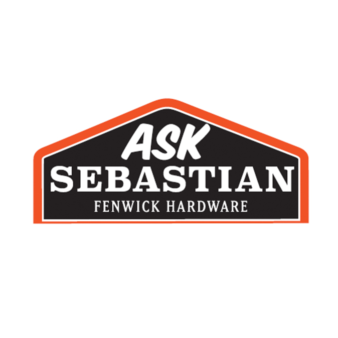
Fenwick Hardware

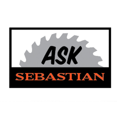
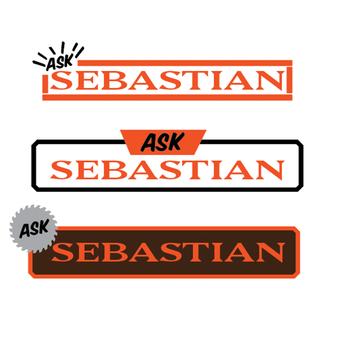
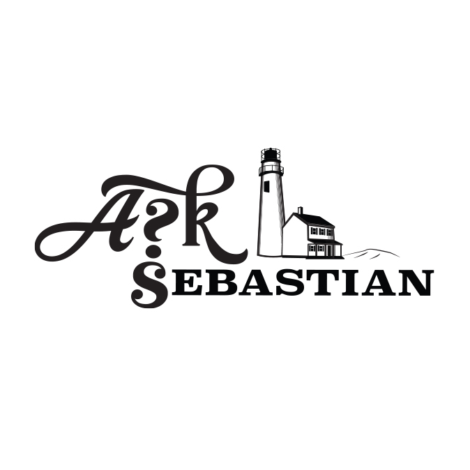
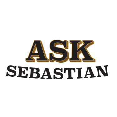
Logo Design "Ask Sebastian"

For my very first blog post I wanted to start with a project that has been almost as long in development as this website and blog. I developed this logo in the course of my job as digital designer for Menmonic Agency.
It all started back in late 2019, we had FINALLY launched the Mnemonic Brand website and we were starting to receive client based work from all over the country. One of the creative leads from the east coach reached out about a small town hardware store, that wanted to support their local contractors and grow their brand. The idea was to “Ask Sebastian” which would be the call to action on tv commercials, In-store displays and other collateral.

With this in mind I began brainstorming. First focusing on the existing branding of the store I used their fonts and color scheme ( Matrix II and #f05224) in case you were wondering. The first round were straight forward and simple placing emphasis on the Sebastian part of the logo instead of “Ask”. Sebastian is the owner of the store and the marketers wanted to make sure he was included. This version of the logo was not well received, They wanted more Ask and a little more personalization. So I pulled inspiration from all over, the california-esc road sign used sebasitans glasses. I drew the local light house and even tried to show the old hardware vibe with some texture and dimensions in the ASK.

Then I landed on the idea of using the shape of their building. It was a small town so I figured the hardware store would be its own recognizable landmark. I also tested out the a badge version of the logo, something that was encapsulated and could stand on its own. I sues a backwards question mark in place of the S in ASK and used question marks along the sides for texture. The client liked the idea behind this, however they wanted a more simplified version. The final logo as seen at the top is what was finally turned over to the client. Over a year after we started It was finally finished.